![]()

This blog started 28th September 2008 as a quick communication tool for exchanging information, comments, thoughts, admonitions, compliments etc… related to the questions of climate change, global warming, energy etc…
![]()
This blog started 28th September 2008 as a quick communication tool for exchanging information, comments, thoughts, admonitions, compliments etc… related to the questions of climate change, global warming, energy etc…
I was working today (09 Jul 2023) in the weather station, when a far away rumbling announced that something bad was on its way… and indeed, the sky fast became frighteningly black…
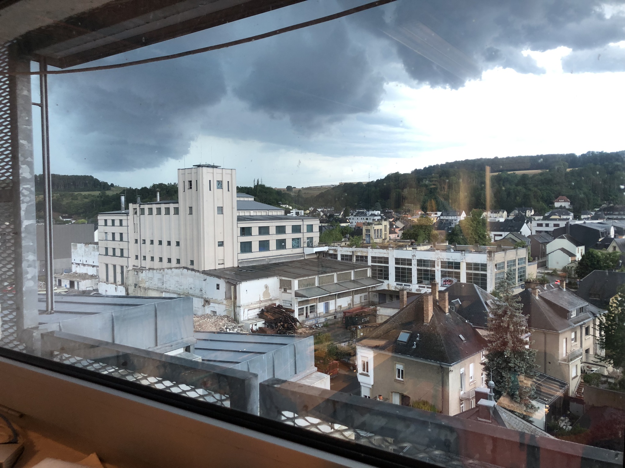
…as this view out of one of the windows shows. The grey building with the tower is the old brewery (Brasserie de Diekirch), which is being dismantled. The Boltek LD350 detector became very busy, showing a stream of lightning strikes and both red alarms on…
After some time a serious downpour began, with the rain-drops making a heavy noise on the metal roofing…
I made a series of screenshots of our lightning page, where the radar-screen is updated every 2 minutes; here that animated GIF:
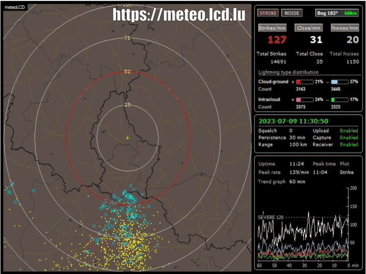
Clearly the storm travels from the South-West to North-East, as storms here usually do. What makes this apart is that at the beginning it was a rather spread-out storm, which than slowed to a near halt over Diekirch and concentrated there its activity for quite some time. Finally it started to dissolve and continued its migration to the North-East. The blue symbols correspond to most recent lightning strikes (of all type), and the yellow to older ones. The red circle centered on Diekirch has a radius of 50 km.
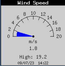
Our Davis backup Vantage Pro station shows a high wind-speed of 19.3 m/s (= 69 km/h), quite impressive for a location down in a valley.
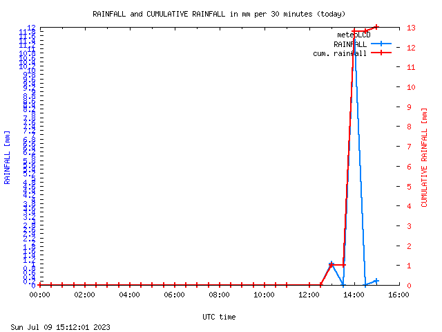
The precipitation peak was about 11 mm for a very short time:
.. and as usual, our Geiger counter happily joins the crowd and jumps up:
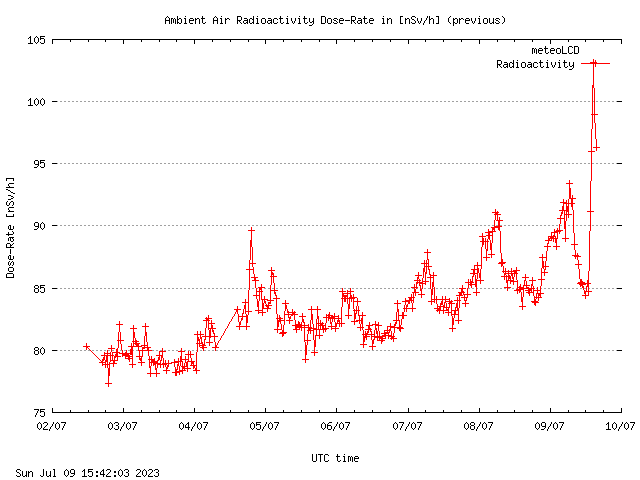
The jump in atmospheric radioactivity shows the effect of radon washout caused by the rain peak. If this point is of interest to you, put “radon washout” in the search box of the WordPress page, and see how often this happens.
Now you may ask perhaps what I had to do on a lazy Sunday afternoon working at meteoLCD?
We had some severe problems with our regular uploads by ftp to our provider (Restena). These intermittent problems triggered a rate-limit at irregular intervals. After much discussion and correspondence with the helpful Restena people, the problem has been solved. But just as an insurance, I built a local webserver which mirrors the today_01.html page with all our live data; as usually, problems were kreeping in, but the mirror system (which runs on a vintage computer) is now stable, and I had to update the backup computer which sits on the shelf to jump in when our main Linux server goes bust.
So in case that the normal fast updates of our data to Restena become blocked, the mirror page should continue to handle the job:
That’s all for today….
Since “immemorial” times (actually 1997) we measure the thickness of the ozone layer at Diekirch, Luxembourg (we = Francis Massen & Mike Zimmer). Our two instruments are small handheld MICROTOPS II “ozonometer” devices from Solar Light Company.

Measurement is done by pointing the instrument to the sun (what is called DS direct sun measurements), and taking several measurements (usually 3 to 5, during one moment of the day, preferentially close to 11-12 UTC time). Each measurement is the average of ca. 45 rapid “firings”. You have to point carefully to get good readings (see here) !
This instrument has been developed many years ago, and is the spin-off of Forest Mims III, an American scientist who didn’t believe NASA’s satellite base ozone measurements were correct, and developed his own el-cheapio instrument, showing that NASA was wrong (he received the Rolex award for this in 1993!). See a bio of this exceptional person here and his website here.

All our “raw” data files are available at https://meteo.lcd.lu/data/. We regularly check our measurements against those made at Uccle (Belgium, close to Brussels), by the RMI (Royal Meteorological Institute). Dr. Hugo de Backer is responsible for the TOC measurements made at Uccle with two very expensive Brewer instruments from Kipp & Zonen:

On top of this, Uccle makes ozone soundings with balloons, and is considered as one of the world reference stations for measuring the thickness of the ozone column. Their data go back to 1972, and are published here:

This plot (screenshot 1 Feb 2023) shows how rapidly the TOC changes on a daily basis, but also that there is a clear sinus-pattern during the year, with a maximum in spring and minimum in autumn. The yellow region represents the boundaries of 95% of the observations, and the visible brown curve the average from 1972 on. The blue plot are the readings for 2023, the black those of the last year 2022.
So when comparing our Microtops measurements, the first criteria should be the synchronicity between the observations at Diekirch and at Uccle. Look at the next plot, which shows the 2022 observations made the same day at Uccle and Diekirch (we made measurements for a total of 180 days, Uccle with both Brewer instruments for about 291 days). These correspond to direct sun (DS) measurements, which obviously need the sun to shine! We have days where Uccle is silent, and vice-versa. There remain 164 common days to compare. When available, MK3 readings are used, when not MK2).

The x-axis is not a regular time-axis, but simply corresponds to measurements from January to December. What is directly visible, is that both instruments clearly are extremely well in sync:peaks and troughs happen simultaneously at Uccle and Diekirch. One also sees that our (blue) curve is practically always lower than the red one, which means that our Microtops readings should be multiplied by a calibration factor (or adjusted for an offset).
Plotting the Uccle data versus the Microtops gives this factor:

The linear fit shows that the Microtops readings should be multiplied by 1.02755 to calibrate them to the Uccle Brewer instruments; in simpler words, our instrument is ca. 2.6% low compared to the reference Brewers (making no difference between them). This means, that for instance instead of correctly measuring 300 DU, the Microtops reads 292 DU. Now Uccle has two Brewer in operation: an older Mk II and the newer MK III.
Here is what we get if we take only DS measurements from common days and divide MK3 readings by those of the older MK2:

You see that there are peaks crossing the 1.05 fraction, so even these very expensive instruments deviate somehow; the maximum same day difference is 24 DU.
Let us plot MK3 readings versus MK2:

One notes that MK3 deviates by ca. 0.8% from MK2.
So once more we can be satisfied with our TOC measurements. This continuity demands real efforts from both of us, who do all this work on a voluntary non-paid basis. Being the only station in Luxembourg(we are WOUDC station 412) making total ozone column measurements since 1997 i.e. more than 25 years is an endeavor meteoLCD can be proud of.
Previous comparisons can be found in the “Papers” section of the meteo.lcd.lu web-site.
A new paper by Mingzu et al. published in Theoretical and Applied Climatology (Springer) researches the changes of planetary albedo during the years 2001 to 2018. The albedo is the percentage of incoming solar radiation reflected back to the space. It is approx. equal to 0.3 (or 30%).
The paper finds a change of -0.0020/decade, i.e. the planetary albedo diminishes, and this increases the radiative solar forcing and as a consequence causes a warming.
Here a quick back of the envelope calculation:
We know that an increase of 22 pmV_CO2 causes a forcing of 0.2 W/m2
A decrease of 0.01 of albedo causes a forcing of 3.4 W/m2
So a decrease of 0.002 of albedo causes a forcing of 3.4/5 = 0.68 W/m2 which is equivalent to an increase of 0.68/0.2*22 = 75 ppmV CO2 .
Now, looking at the Mauna Loa data, we see that CO2 increases by 43 ppmV from 2001 to 2018 ( = 19 years), which corresponds to 43/1.9 = 24 ppmV/decade (rounded value).
Conclusion:
Albedo change is equivalent to an increase of 75 ppmV CO2 per decade
We observe: 24 ppmV CO2 increase per decade, which is about 1/3 of 75 (24/75 = 0.32)
Ergo: 2/3 of the observed global warming is not caused by increasing CO2

See also here.
Since long time I have a link to the excellent electricity maps which give the carbon intensity (in gCO2eq/kWh) of electricity production. On the map there is now an supplementary information: it shows the trans-border flows to the neighboring country.
Here is the situation today 15 Dec 2022, at 18:00 local time:

Our ENOVOS national company always says that all their electricity is green; there seems to be some problem with colorblindness here!
We see that with the exception of the northern countries and Switzerland, which have huge hydroelectricity sources, France remains the unbeaten, but constantly unsung hero in low-carbon electricity. At this hour Germany was at 661g CO2eq/KWh, France at 124g CO2eq/KWh, importing 78MW “dirty” German electricity (but much more from Switzerland and Spain). At the moment of writing Switzerland exports to France (992MW), Germany (1.61GW) and Italy (390MW).
Watch this excellent site, and show it to your political people, if these are again hyping the German “Energiewende”.
Many times in the past I have posted on the relationship between the thickness of the ozone column (the TOC measured in the Dobson Unit DU), and the effective UVB irradiance at ground level. We (Mike Zimmer and myself) measure the first with our Microtops instruments, and the latter with our UVB Biometer (in minimal erythemal dose power, unit MED/h, or the derived UV index (UVI, were 1 MED/h corresponds to 25/9 UVI): all weather and solar conditions being the same, a higher TOC means lower UVB (or UVI) intensity. See references [1] to [5] or just type RAF into the SEARCH box on the upper right of the screen to find all previous publications in the blog.
From the 4th to the 10th March 2022 we had very fine weather in Diekirch, with cloudless blue skies:

This plot clearly shows that during the 4 days from the 5th to 8th March the UVI ( or the UVBeff given in the green boxes) is increasing, and the TOC given in the red boxes is decreasing; the opposite happens during the next 3 days. The measurements have all been done at nearly the same hour (around 12:00 UTC), the solar position given by the solar zenith angle (SZA) is practically the same (around 55°), and the solar irradiance measured by our pyranometers also varies not much (maximum between 570 and 621 W/m2 on a horizontal surface).
In the next plots I have added the data from the 11th March (same blue sky). First a simple plot of UVI versus TOC:

If we take the first and sixth points as a “worst case”, we see that a decline of about 60 DU increases the UVI from 1.70 to 2.50. A simple rule of three to keep in mind would be “100 DU less means 1.3 more UVI”.
This is effectively nothing to be afraid of!
The RAF
The radiation amplification factor is not defined by a linear relationship, but by a logarithmic one; if we plot the negative natural logarithm of UVBeff (= -ln(UBVBeff)) against the natural logarithm of the TOC ( =ln(TOC)), the slope of the trend-line represents the RAF:

From the equation of the trend-line we see that the slope is 1.178, so the RAF computed from these 8 days is about 1.18
The following table gives all the meteoLCD calculations, and as a comparison the values given by Jay Herman in his paper from 2010 [6]:

It’s really surprising how close our March values are.
Please read also the interesting paper of Schwarz et al. who use anomaly values for the study of the relationship between TCO and UVI [ref. 7]:

There is some discussion if the TOC readings should be replaced by the TOCslant = TOC/cos(SZA), as the RAF varies with the SZA (see the Herman paper); for these March 2002 readings, this would change the RAF to 1.43.
We will retain the non-slanted TOC in our comparisons (past an future).
References:
[1] MASSEN, Francis: Radiation Amplification Factor in April 2021 (link)
[2] MASSEN, Francis, 2018: UVI and Total Ozone (link)
[3] MASSEN, Francis, 2016: First Radiation Amplification Factor for 2016 (link)
[4] MASSEN, Francis, 2014 : RAF revisited (link)
[5] MASSEN, Francis, 2013: Computing the Radiation Amplification Factor RAF using a sudden
dip in Total Ozone Column measured at Diekirch, Luxembourg (link)
[6] HERMAN, Jay, 2010: Use of an improved radiation amplification factor to estimate
the effect of total ozone changes on action spectrum weighted irradiances and an instrument response function. Journal of Geophysical Research, vol.115, 2010 (link)
[7] Schwarz et al.: Influence of low ozone episodes on erythemal UVB-radiation in Austria. Theor. Appl. Climatol. DOI 10.1007/s007004-017-2170-1 (link)
——————————————-
A small EXCEL file with all March 2022 parameters can be found here.

An important addendum has been added the 5th October 2021.
Please read it at the end of the main text!
(missing fig. 19 added 05 Nov 2021)
———————————————-
It’s springtime in the Antarctica, and the well known ozone hole has again reached a spectacular dimension, extending well over the border of the continent; the picture shows the 23 million km2 hole at the 15th September 2021, covering more than the whole Antarctic continent (see https://ozonewatch.gsfc.nasa.gov/statistics/annual_data.html).
The Montreal Protocol signed in 1987 (and now counting 196 signature nations) was meant to avoid this anthropogenic thinning of the ozone layer by phasing out the CFC’s (chlorofluorocarbons) gases found to be the big ozone destroyers.
In this blog, I will see if this aim has been reached. I will start with some comments on ozone, its measurement and the scientists who received the Nobel price in 1995 for their research of atmospheric chemistry, and especially ozone creation and destruction.
1. Ozone, a delicate gas
Ozone (O3) is a very fragile gas, easily destroyed (it splits into O2 + O, where this single oxygen than reacts readily with other substances); for instance blowing a stream of ozone gas over a rough wall destroys a large percentage of the O3 molecules. This means that if ozone is sucked into a measuring instrument , the tubing must be very smooth, so that normally Teflon is used.
Ozone is created in nature essentially by two means: by lightning (electrical discharge) and by UV radiation. As it is very reactive, it is considered at ground level and higher concentrations a pollutant, harming biological tissues (like lungs and bronches) and also plants and crops. Its sterilizing properties are used in UV lamps installed for instance in the chirurgical environment and in water treatment plants. It has a very distinctive smell, and often can be smelled after a strong lightning storm.
2. Ozone in the atmosphere
Ozone is ubiquitous, found throughout the whole atmosphere, from ground level up to it’s top (TOA = Top Of the Atmosphere); the concentrations vary strongly with altitude. The ground level concentrations for instance are about 40 times lower than the peak concentration between 30-40 km:

The atmospheric O3 concentration at ground level is normally given in Dobson Unit (DU), named after Gordon Dobson (Uni Oxford), who in 1920 built the first instrument to measure ozone concentration. Imagine a cylinder with a base of 1m2 going from ground level to TOA. Now imagine that all gases except the O3 molecules are removed from this cylinder. Finally compress with a piston the O3 molecules to the bottom (kept at 0°C) until a pressure of 1013 hPa is reached. The height of the compressed gas would normally be about 3mm or 300 hundredth of a mm. One DU = 1/100 mm, so the concentration would be given as 300 DU and in fact corresponds to 300*2.687*10^20 = 8*10^22 ozone molecules. The DU number represents the Total Ozone Column (TOC), and all ground based measuring stations use this unit.
As UV radiation creates O3, it is also absorbed by ozone; the usual TOC instruments measure the absorption of several wavelengths in the UVB region (typical around 300 nm), and possibly some others to measure for instance the atmospheric water content. The Microtops II instruments that are in use at meteoLCD for measuring the TOC use the 305.5, 312.5 and 320 nm wavelengths [ref.1].
The very expensive Brewer Mark I and II instruments of the RMI (Royal Meteorological Institute of Uccle, Belgium) use optical gratings to have a much higher number of relevant wavelengths, and as such a better resolution.
The TOC varies enormously during very short periods, but over many years the daily averages follow a sine pattern, having in our region a maximum in spring and a minimum in autumn. The sinus-curve in the following figure represents the daily average at Uccle from 1971 to 2020 [ref. 3]

Read also this short paper on the cycle found at meteoLCD [ref.12]
Ozone soundings with balloons or lasers through the atmosphere are made from time to time; the following figure from RMI shows that the real distribution of ozone through the atmosphere is much more variable than suggested by the smooth curve in figure 1:

3. The ozone hole
Regular TOC measurements started with the International Geophysical Year in 1956. The next figure (which is a subset) shows the measurements over the minimum of Antarctic TOC from 1956 to 1979:

During the 80’s it was found that in autumn (September-October) the TOC reached very low values over the South Pole (which corresponds to the local spring time), extending even over much the Antarctic continent. The British scientists Farman, Gardiner and Shanklin reported in 1985 exceptionally low TOC values over the Halley and Faraday Antarctic research stations, a drop of about 40%. It was Farman who is credited introducing the name “ozone hole”, but it is possible that the Washington Post first used it in an article . A record minimum of 73 DU was measured in September 1994; for comparison the lowest value measured by meteoLCD in Diekirch since 1997 was 208.5 DU (18 November 2020). Fig. 5 shows the yearly minima of the Antarctic ozone hole and at Diekirch (Luxembourg):

Why should one worry about this ozone hole? The ozone layer in the stratosphere absorbs completely the shortest UV radiation wavelengths , as UVC (< 280nm), and a large part of the UVB spectrum (280-320 nm). UVB is important for some biological processes (like the production of vitamin D in humans), but a too large intensity creates havoc with cellular DNA and may lead to skin cancer, for instance. As the Antarctic is virtually population-free and vegetation free, this is not a problem on that continent; but if the CFC caused destruction works over the whole planet, there certainly will be an important health risk when the ozone protection screen becomes too thin.
Our measurements at meteoLCD show clearly that a lower TOC increases the biologically effective UVB radiation at ground-level, as documented in the following figure [ref. 11]:

4. The 1995 Nobel price in chemistry
The 1995 Nobel price in chemistry was given to 3 researchers in atmospheric chemistry: Paul Crutzen, Mario Molina and F. Sherwood Rowland. Crutzen’s work in the 1970’s was on the O3 destruction by naturally occurring nitrogen oxides, but Molina and Roland found in 1974 that the chlorofluorocarbon type chemical substances (CFC’s, with CFC-11 often called Freon by its tradename from Dupont de Nemour) release a very active chlorine ion in the cold upper atmosphere, which acts as a catalytic destroyer of ozone. One Cl- ion may destroy 100000 ozone molecules! The system of chemical reactions involved is rather complicated, and I suggest to read the lecture given by Molina in 1995 during the Nobel price ceremony [ref. 4].

This complex chemistry is not only fuelled by human emitted substances. One very often finds in the literature that CFC’s are a finger print of anthropogenic emissions, but it seems that the situation is more complicated. According to cfc-geologist [ref. 5] volcanoes also emit these compounds; a second important natural source of ozone depleting substances (ODS) is methyl bromide (CH3Br, also called bromomethane), emitted by algae (but also by humans for soil fumigation, for instance). A list of the many ODS can be found at the EPA website [ref.6]. This list also contains halons, like these used in fire protection systems.
For a very complete and more recent (2017) discussion of all the relevant equations and their kinetics see the paper by Wohltmann et al. [ref. 7].
5. The Montreal Protocol
This protocol, signed by 46 nations in September 1987, came in effect the 1st January 1989 and is ratified today by 197 nations. Its aim was to reduce the production of long-lived CFC’s by 50% by the year 2000, and finally phase it out completely. It is universally acclaimed as being the first protocol in global environmental protection. In 2016 an amendment was signed in Kigali to also phase out the HFC (hydrochlorofluorocarbons) which were the substances used to replace for instance Freon (CFC-11).
The production number of CFC’s indeed plunged to a very low level, at least according to the data submitted by the nations:

So considering this planned phase-out, the protocol seems to be a success.
6. Evolution of the Antarctic ozone hole
The next figure puts some cold water on the efficiency of the protocol. It shows the above graph with the yearly maximum ozone hole area superimposed:

Even if the CFC’s production becomes very low, the area of the ozone hole does not seem to change very much, except some wiggling around the 1994/96 levels. The next two figures show the maximum ozone hole area from 1990 to 2020 (data from NASA ozonewatch):

This plot shows that during the 31 years since 1990 the maximum ozone hole area shrinks by less than 10%. The linear regression suggests a shrinking by 0.7 millions km2 per decade. But note the two strange outlier years 2002 and 2019, which really seem suspect. If we omit these two outliers, we have the following picture:

Without these two outliers, the maximum ozone hole is shrinking in 31 years by a very meagre 0.73 million km2, i.e. by about 3.3%. The linear trend corresponds to an nearly insignificant -0.2 million km2 per decade. This very small number shows that the observational result of the Montreal Protocol is extremely limited until now.
7. Causes of the not shrinking hole
Let us first show the plot given in figure 4 in its entirety:

The figure shows that there is a distinctive ongoing thinning from the mid 1970’s on; but starting after 1992, the picture does not become clearer, neither after 2000: the measurement data show an important spread from year to year, and more intriguingly, from instrument to instrument.
There could be some very banal causes, which might be suggested by the stratospheric concentration data and by an increase of CFC-11 emissions after 2013 (possibly caused by illegal manufacture in China) [ref 8]:

Another or further reason might be that reversing the thinning takes many decades, possibly more than half a century, as predicted by some scientists [ref. 9] [ref.13]:

But there are also some reasons for hope. Direct measurements of reactive Cl- ions in the ozone hole (which were nearly impossible in the past) by a new satellite microwave sounder (MLS) has given examples that a yearly smaller DU loss correlates with a somewhat lower chlorine concentration [ref. 10]


8. Conclusion
So the least we can conclude, is that the picture remains muddled, and that reality is not what is found in the often glowing media reports, which present the Montreal Protocol as a definitive success story. The protocol is probably efficient in the very long run, but it certainly is not a quick acting fix. It is a very good example that tinkering with atmospheric gases is a complex matter, with the science far from settled, as shown for instance in the 2018 paper by Rolf Müller et al. [ref.14]. T
This lesson should also be heard by the CO2 alarmist who expect that rushing into a net-zero carbon policy would have immediate results.
ADDENDUM (05Oct2021):
There is very important chapter 2 by Douglass et al. published in the 2010 version of “The Scientific Assessment of Ozone Depletion” (link to all assessment reports); the title of this chapter 2 is “Stratospheric Ozone and Surface Ultraviolet Radiation” (link); here a link to a version with highlights added by me.
First let us start with fig.5 which shows the variations of TOC at two stations not too far away from Diekirch, Hohenpeissenberg and Haute Provence:

The measured TOC anomalies w.r. to the 1979-2010 mean (black curve) do not show any visible trend from about 1995 on. The next figure shows the erythemal UVB irradiances during the summer months May to August at Bilthoven (NL) and Uclle (BE): not surprisingly there is no trend in Bilthoven starting 1995, and a possible small positive trend in Uccle:

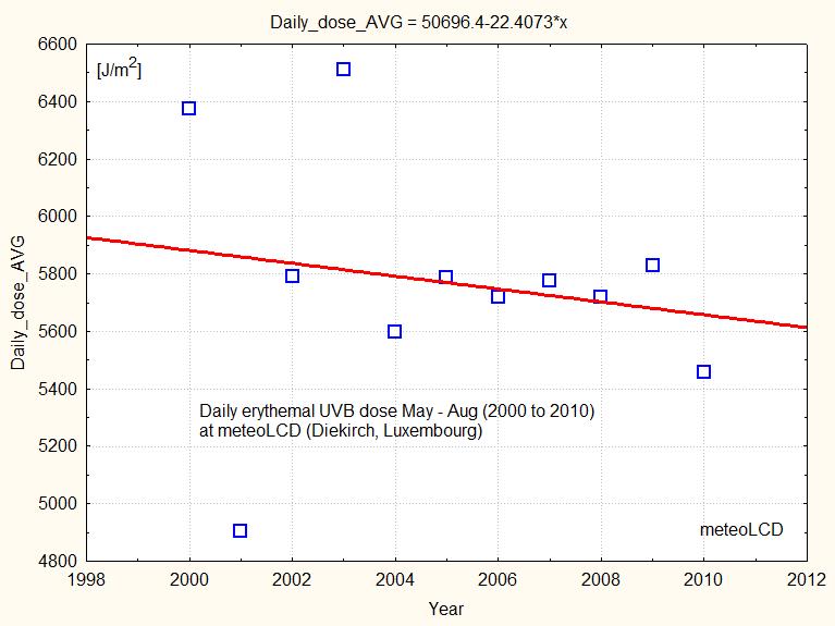
At meteoLCD the corresponding daily dose is decreasing from 2000 to 2010, as shown in figure 17:
Douglass also shows a figure with the minimum yearly TOC over the Antarctic core zone: look at the right part of the bottom graph which shows DU values that are practically constant.

The report many times writes that the ozone changes are not only caused by chemical destruction, but also for a large part by atmospheric dynamics, and that it is not easy to disentangle these to effects.
The last figure 19 on the chemical depletion also shows that from about 1992 to 2005 the few direct observations (black triangels) show a practically constant ozone depletion by chemical effects (and a huge variability of the many models).

References:
Ref 1:
https://meteo.lcd.lu/papers/Comparison_Microtops_Brewer16_2012.pdf
Ref 2:
https://ozone.meteo.be/research-themes/ozone/instrumental-research#graph-ozone-container
Ref 3:
https://meteo.lcd.lu/papers/annual_cycle.pdf
Ref 4:
nobelprize.org/uploads/2018/06/Molina-lecture.pdf
Ref 5:
cfc.geologist-1011.net
Ref 6:
https://www.epa.gov/ozone-layer-protection/ozone-depleting-substances
Ref 7:
https://acp.copernicus.org/articles/17/1/10535/2017/acp-17-10535-2017.pdf
Ref 8:
https://www.pnas.org/content/118/12/e2021528118
Ref 9:
https://www.nature.com/articles/s41467-019-13717-x
Ref 10:
https://earthobservatory.nasa.gov/images/91694/measurements-show-reduction-in-ozone-eating-chemical
Ref 11:
https://meteo.lcd.lu/papers/MASSEN/RAF_from_sudden_TOC_dip.pdf
Ref 12:
https://meteo.lcd.lu/papers/annual_cycle.pdf
Ref 13:
https://www.nature.com/articles/s41467-019-13717-x.pdf
Ref 14:
https://acp.copernicus.org/articles/18/2985/2018/
Ref 15:

There is a new paper published in April 2021 in Research in Astronomy and Astrophysics titled “How much has the Sun influenced Northern Hemisphere temperature trends? An ongoing debate” (link). The authors are R. Connolly, W. Soon, M. Connolly together with 19 coauthors. All these people are from well-known universities or research facilities, and as such have impressive scientific backgrounds. The paper is quite long, more than 70 pages including a huge 536 items reference list. I recommend a careful reading of this paper that is the best overview of scientific knowledge regarding the sun-climate question I know of. What makes this paper unique is that it presents many facets of the problems of the TSI variability and of NH surface temperature series. It honestly states that not all coauthors share the same conclusions, so it clearly is not a cherry-picking paper pushing an activist agenda. As this is such a large and diverse paper, I will just touch on a few aspects, and try to give a short summary.
Its main conclusion is that the IPCC’s stand on the influence of the sun on global warming is at least open for discussion, and ignores a huge amount of scientific findings that conflict with its anthropocentric view on human caused climate change.
The problems with knowing TSI
Everybody knows that the sun is the engine that drives Earth’s climate, and that the energy output of this big thermonuclear reactor is not constant. Best known are the 11 years Schwabe cycle of total solar intensity, and the 22 years Hale cycle of its magnetic activity. The TSI (irradiance in W/m2 on a surface perpendicular the the solar rays, measured at TOA, the top of the atmosphere) really is directly and continuously measured only since the satellite times, starting in 1978 with the NIMBUS 7 satellite and its ERB (Earth Radiation Budget) mission. Previous data are more patchy, coming from soundings with balloons and rockets, or from indirect proxies like solar spots, changes of the solar magnetism measured at ground level or even planetary (astronomical) causes.
43 years of satellite measurements covering nearly 7 Schwabe cycles should be enough to yield a definitive answer for TSI variability, but this is alas not the case. The satellites instruments degrade with time, and successive satellites have different biases and measurement problems:

The figure shows that the series differ by about 10 W/m2, so simply stitching together these series is impossible (just to set this number: the increased radiative forcing caused by the higher atmospheric CO2 concentration from 1750 to 2011 is about 1.82 W/m2, according to the IPCC AR5) . Two best-known efforts to get a continuous “homogenized” series are those from the ACRIM (USA) and PMOD (Davos, CH) teams. Both come to different conclusions: according to ACRIM there is a general increase in TSI, whereas PMOD thinks that TSI remains more or less constant. Needless to say that the IPCC adopts the PMOD view that conforms more to its policy of anthropogenic caused climate warming, and ignores ACRIM
If one includes the proxy series, as this paper does, there are 16 different TSI reconstructions that may be valid. So the least that can be said is that an honest scientific broker should exanimate, and not ignore, them all.
High and low variable TSI series
The 11 year cycle is not the only one influencing TSI; there are also many multidecadal/multicentennial/multimillennial cycles which can be found by spectral analysis or by astronomical causes, like the Milankovitch cycles. If these longer cycle variations are considered small w.r. to the Schwabe cycle, the reconstruction is consider “low variability”, in opposition to “high variability”. The authors try to compare both type of reconstructions with the changes in the NH surface temperature, and they find that the latter (high variability) series correspond better with the NH temperature changes since 1850.
What NH temperature series to use?
Clearly the vast majority of weather stations are located in the NH. A big problem is that the ongoing urbanization introduces an urban island warming bias, which is still visible in many of the homogenized series like those of NASA-GISS. So the authors propose to use only the stations that were and still are rural since about 1850. The difference can be startling, as shown in the next figure which takes a NH subset of 4 regions (Arctic, Ireland, USA, China):

The warming trend is 0.41 °C/century for the rural only stations, whereas it is more than double with 0.94 °C/century for the combined rual+urban stations. Notice also the much greater variability (i.e. lower r2) of the rural only series!
This makes it clear that the choice of including all stations (with the risk of including an urban warming bias) or only the rural ones (with the handicap of having much fewer stations) will command the outcome of every sun-temperature research.
An example of the solar influence
The next figure is a subset of figure 16 of the paper; it shows how the trend of a linear temperature fit (blue box = fit of temperature w.r. to time) can be compared to that of the solar influence (yellow box= fit of temp w.r. to TSI) and the anthropogenic greenhouse gas forcings (grey box = fit of temp. w.r. to GHG forcings); the latter are the residuals left over from the (Temperature, TSI) linear fit.

Using rural only stations, and a high variability TSI reconstruction shows that the solar changes could explain 98% of the secular temperature trend (of the NH surface temperatures); using both urban and rural stations, the solar influence is still 57%, i.e. more than the half of the warming can be explained by a solar cause.
Conclusion
In this short comment I could only glance some points of the paper. It has many more very interesting chapters, for instance on the temperature reconstructions from sea surface temperatures, glacier length, tree rings etc.
What remains is an overall picture of complexity, which is ignored by the IPCC, as well in the AR5 and the new AR6. The science on the influence of solar variability, be it in the visible or UV spectrum, is far from settled. The IPCC ignores datasets that conflict with its predefined political view. The recent warming is only unusual if calculated from the rural + urban data series, but mainly unexceptional if temperature data are restricted to the rural stations.
In the past I have written many times on the observational fact that due to radon washout, the ambient gamma radiation shows sometimes impressive peaks ( see here, here, here, here, here, ).
In this blog I will show that the graphs of cumulative rainfall and gamma radiation might give a wrong picture, and that using the original time-series yield a more correct insight.
Here what the graphs of cumulative rainfall and gamma radiation of atmospheric air shows for the week covering the 24 and 25 July 2021:

These graphs are not faulty, but give a wrong picture: the two rainfall peaks cause two radiation peaks, with the second higher that the first, even if its “cause” (= the precipitation in mm per half-hour) is much less. This could be a sign of radon washout during the first peak, and radioactivity levels which have not yet recovered to their usual background.The third precipitation peak during the 25th July does only cause a mild surge of the gamma radiation intensity.
Now let’s zoom on the half-hourly levels of precipitation and gamma radiation:

The picture becomes somewhat clearer: there are 2 precipitation peaks during the 24th July 2021, and the intensity of the second is close to the double of the first ( the X scale represent the multiples of half-hours, starting at 00:30). The second radiation peak is practically the same as the first: the gamma levels have not sufficiently recovered from the first washout during the approx. 7 hours to yield a proportional higher peak.
The third event during the 25th July is more “smeared out”: the total rain volume falls down during ca. 3.5 hours (7 half-hours), and is not concentrated on a single half-hour event. This does not cause a strong radiation increase, even after 20 hours have passed since the last rain-fall peak, a time-span probably long enough to compensate for the previous washout. I suggested in one of the previous blogs a recover period of approx. 1 day.
I always marvel why our “greens” have not yet discovered this natural phenomenon of radiation increase, and not jumped on this pattern which should give a good scare. The second peak here is about 97-85 = 12nSv/h, i.e. 14% higher than the usual background. What would Greenpeace say if radioactivity from the Cattenom nuclear facility had increased by this amount?
.

Many scientists have predicted that wind and PV electricity value will decline above a certain level of penetration, where penetration means the percentage of installed wind and solar capacity w.r. to the total installed electricity production systems (which include for instance fossil fuel and nuclear systems).
A new outstanding paper by Dev Millstein et al. published in JOULE (a CellPress Open Access publication) puts these predictions on solid data foundations. The title is “Solar and wind grid system value in the United States: The effect of transmission congestion, generation profiles and curtailment” (link). The authors analyzed data from 2100 US intermittent renewable electricity producers, and separated the influence of the production profile (e.g. the sun does not shine at night), transmission congestion (e.g. difficulties to transport excessive solar and wind electricity during favorable periods) and curtailment (i.e. cost of shutting down solar and wind producers to avoid net infrastructure problems).
This is a long 28 pages paper, well worth reading several times to become familiar with the different technical concepts.
In this blog, I try to condense the essentials in a few lines.
The short answer is that above 20% of wind/solar penetration, the produced electricity value falls by 30 to 40%.
This is an enormous amount, which may put a barrier to higher wind & solar penetration. This barrier is basically rooted in economic realities, not physics or engineering problems!
2. What is the parameter which has the most influence on value creep?
The authors find that the production profile i.e. the timing of production over a day or longer period is the principal cause of the fall in electricty value:

Look at the highlighted CAISO numbers, which correspond to the situation in California. The solar penetration is large (19%), as is the value fall of 37% ( the is percentage of value decline w.r. to electricity prices which would have been customary when there were no intermittent wind & solar renewable producers).
For most sites, the decline of electricity value follows a logistic curve ( = exponential decline at the beginning which stabilizes at an horizontal asymptote). This is not the case for CAISO, where the decline is practically linear (see the yellow double-line, highlights by me):

The decline from 0 to 20% penetration is nearly 50%, from about 1.3 to 0.6, which is close to breathtaking!
3. What do we have to expect?
Up to now, most of this decline was cancelled or obscured by the falling prices of wind and solar installations. But many factors suggest that the easy part of lowering prices to make PV’s and wind turbines is bygone. There surely will be some fall in prices, but not at the level previously seen. The scarcity of raw materials and rare earths, the low number of producing countries and regions, the increased world-wide demand all point to an end of the spectacular price falls seen during the last years.
So in absence of a breakthrough in storage technology which could change the production profile (remember: this is the main factor of the fall of electricity prices!), some countries will rapidly hit the wall. Sure, politics and overt or hidden subsidies for wind & solar may obscure this price creep, but these will inflate electricity prices above levels that even the most green-inclined citizens are willing to pay. Knowing that their sacrifices will have no measurable influence on supposed global evil climate destructive CO2 levels will certainly be a barrier for increasing sacrifices in life-style, which are asked for, and by this value decline in wind & solar electricity that should save the planet.
4. Some conclusions of the authors
All this should somehow dampen the naïve and “politically correct” enthusiasm for an exclusively wind and solar driven world!
We had a period of several cloudless, blue sky days at the end of April 2021. So time to redo a calculation of the Radiation Amplification Factor RAF. In short, we want to see how the variation of the Total Ozone Column (TOC) influences the effective UVB radiation at ground level. I wrote several time on this, and usually we found an RAF of approx 1.05 to 1.10.
First here a graph showing the variation of total solar irradiance (blue curve, unit W/m2) and the effective UVB (red curve, unit mMED/h):

First remark that the peak solar irradiance was practically constant; the 24th April was a bit hazy, so it will be left out in the computations. The numbers in the turquoise boxes are the maximum values of the TOC, measured in DU (Dobson Unit) with our Microtops II instrument (serial 5375). Let us first plot the UVBeff versus the TOC:

Clearly the UVBeff values decrease with increasing TOC, as the thicker ozone column filters out more UVB radiation. The empirical relationship is practically linear, and suggests that a dip of 100 DU (a quite substantial thinning of the ozone layer) would cause an increase of effective UVB of about 0.6 MED/h or 1.7 UVI (as 1 MED/h = 25/9 UVI).
The numerical correct definition of the RAF is : UVB = C * TOC**RAF where ** means “at the power of” Taking the natural logarithm gives ln(UVB) = ln(C) +RAF*ln(TOC) or RAF = [ln(UVB – ln(C)]/ln(TOC).
If we have many measurement couples of UVB and TOC, it can be shown (see here) that
RAF = [-ln(UVBi/UVB0)]/[ln(TOCi/TOC0)]
where the index i corresponds to the ith measurement couple, and 0 to that taken as a reference (usually i=0). This is equivalent to say that RAF is the slope of the linear regression line through the scattterplot of -1*ln(UVBi/UVB0) versus ln(TOCi/TOC0).
Here is that plot:

The slope is 1.0461, so the (erythemal) RAF computed from the 5 blue sky days is RAF = 1.0461 ~1.05
This has to be compared to the value RAF = 1.08 in the referenced paper [ref. 1]. Note the excellent R2 = 0.96 of this linear fit.
There is some discussion if TOC should be replaced by TOCslant = TOC/cos(SZA), where SZA is the solar zenith angle. If we do this, the RAF ~ 1.10, close to the previous value; the R2 is somewhat lower with R2=0.91. The SZA is practically constant for the 5 days wuth SZA ~38° .

The RAF = 1.10 value is close to what Jay Herman published in GRL in figure 8 [ref. 2] (red lines added):

Conclusion
These 5 days of cloudless sky give practically the same results for RAF as that found during previous investigations. As a very raw rule of thumb one could keep in mind that a dip of 100 DU yields an increase of at most 2 UVI. The following table resumes the findings of this paper and the references 1 to 5:

______________________________________
References:
[1] MASSEN, Francis, 2013: Computing the Radiation Amplification Factor RAF using a sudden
dip in Total Ozone Column measured at Diekirch, Luxembourg (link)
[2] HERMAN, Jay, 2010: Use of an improved radiation amplification factor to estimate
the effect of total ozone changes on action spectrum weighted irradiances and an instrument response function.
Journal of Geophysical Research, vol.115, 2010 (link)
[3] MASSEN, Francis, 2014 : RAF revisited (link)
[4] MASSEN, Francis, 2016: First Radiation Amplification Factor for 2016 (link)
[5] MASSEN, Francis, 2018: UVI and Total Ozone (link)
