Archive for October, 2015

The never vanishing ozone hole

October 27, 2015

30 October 2015: added link to paper (see at the end)
_______________________________________________
I just read a short article by Steve Goreham titled “Did we really save the ozone layer?” (link).

After the Montreal Protocol most nations were phasing out their use of ozone depleting substances (ODS, like freon), and since about 20 years there are practically no much human emissions left. Remember that these evil fluor-carbon molecules are seen as the culprits causing the yearly thinning of the ozone layer above Antarctica (the Ozone Hole). During October and November total zone column may plunge to 100 DU in that hole.

Has this phasing out of ODS fostered a closing of the zone hole? Really not, as shown by this graph:

ozone_hole_2015 Since 1996, the area of the ozone hole remains more or less at 20 to 25 millions km2, while the ODS consumption and emission (red curve) fall to zero. Could it be that the whole theory (which gave Molina and Roland their 1995 Nobel price) is either bogus or at least incomplete?  The ozone destroying chemical reactions found by the 2 Nobelist certainly exist; there remains the nagging suspicion that other, possibly more important ozone munching phenomena  as the human ODS emissions might be at work.

How inconvenient that Nature so often refuses to obey our glorious models and the political decisions based on them!

_______________________________

30 October 2015:

See this paper by Gribble: (paywalled):

The diversity of naturally produced organohalogens.

“More than 3800 organohalogen compounds, mainly containing chlorine or bromine but a few with iodine and fluorine, are produced by living organisms or are formed during natural abiogenic processes, such as volcanoes, forest fires, and other geothermal processes. The oceans are the single largest source of biogenic organohalogens, which are biosynthesized by myriad seaweeds, sponges, corals, tunicates, bacteria, and other marine life. Terrestrial plants, fungi, lichen, bacteria, insects, some higher animals, and even humans also account for a diverse collection of organohalogens.”

Ozone: change is the norm!

October 26, 2015

In the discussions about climate change, one often gets the impression that the media and the political people aim for a stable climate (actually they mean “weather”), something like a paradise-like smooth state without any nasty, big and extreme variations and perturbations. The chaotic nature of our atmosphere should tell them that this can never be the case, and that battling to stop climate change is and will remain futile. Here I will write some words on the variability of the total ozone column (TOC). The atmosphere has a variable concentration of ozone (O3), that delicate gas that comes and goes according to solar, temperature and presence of precursor gas conditions.

1. Ground ozone.

We find ozone everywhere, but two regions are the most important: the ground layer where we live and breathe can have O3 concentrations that change up 200 ug/m3 (about 100 ppb) during good (pre-) summer days. Many factors impact this concentration, the most important being (besides temperature) the availability of UVB radiation and precursor gases. Here the most important of these are the natural isoprenes emitted by trees and plants, and the NO2 which mostly comes from traffic related emissions (there are other gases like industrial VOC’s, which have a smaller impact). As vehicles also emit NO, which destroys ozone, we have very different nightly profile in clean air rural and high traffic urban places. Look at the following picture, which gives the ground ozone levels measured at Bonnevoie ( = Luxembourg-City) and Diekirch (=semi-rural) during the week ending the 26th October 2015.

Dk_Bonnevoie_weekupto26OCT2015

The blue rectangle shows the situation in the night of the start of the 22th October 2015: in a same interval of about 6 hours, the ozone concentration in the city location (top) diminishes by 27 ug/m3 (about 13.5 ppb), whereas at Diekirch without not much nightly traffic the fall is only 8 ug/m3 (4 ppb). The rapid decrease in Luxembourg-City is due to the emitted NO, which destroys the existing ground ozone, a removal that is much slower in Diekirch where there is not much nocturnal emitted NO !

So looking at a daily ozone pattern tells you immediately if the location was urban or rural.

Every May/June, when ground ozone levels are on the rise, the Luxembourg environmental agency issues warnings, as they take wrongly and stubbornly as a reference the O3 levels at the Mont Saint Nicolas in Vianden, a very rural location without only a minimum traffic, but a very rich tree cover. The natural isoprenes, together with clear and non-polluted air (i.e. rich UVB irradiance) makes the ozone levels at this location the highest for Luxembourg. This has nothing to do with noxious human activities, but is an absolute natural phenomenon.

As I will speak in this blog on variability, just look at the extreme swings in the ground ozone concentration: the O3 levels never are constant, but vary from close to zero in the morning to their late afternoon peak.


2. Total ozone column and UVB  irradiance.

The major part of the ozone is located in the stratosphere, between 15 and 50 km with a maximum around 25 km; the concentration there is about 6 times higher than at ground level. This “good ozone” layer absorbs the short-wave and dangerous UV-C radiation (with wavelength below 280 nm) completely, and also part of the UVB radiation (280 to 320 nm). The total ozone column is measured in Dobson Units (DU): if all the ozone contained in a vertical column would be compressed to normal atmospheric pressure, the height of that column would be about 3 mm or 300 DU. Usual numbers in our region vary from 250 to over 400 DU. About 10 to 20% corresponds to the ozone at the ground layer (the “bad ozone”), the major part is stratospheric ozone (the “good ozone”).

The influence of the thickness of the ozone layer on the UVB irradiance can be shown from our measurements at meteoLCD (see this paper). The next figure from the cited paper documents that a thinning ozone layer will increase ground UVB irradiance.

DU_UVB

The 22 April 2013 the TOC (total ozone column) was 381.8 DU, and the effective UVB irradiance about 1.5 MED  (MED = minimal erythemal dose); the next day with the same meteorological conditions, the TOC fell down to 265.8 DU and the effective UVB irradiance increased by 0.68 MED, about 2 UVI (UV index). A dip of 100 DU would correspond to an increase of 1.7 UVI.


3. The extremely variable total ozone column

Many factors influence the thickness of the total ozone column, which varies often in  a spectacular manner. Look at the next figure which shows the TOC measured at Uccle (near Brussels, Belgium) for this year 2015:

dobson_Uccle_upto26Oct15The read line represents the DU readings for this year 2015 up to the 25th October, the grey part of the plot are the readings from last year. Uccle has one of the longest DU series in Europe, starting 1979. The sine-wave represents the average of all measurements from 1979 to today. Clearly the TOC is highest in spring and lowest in autumn. The next 3D diagram shows this in a more beautiful way for the global region between 45° and 50° latitude North.

dobson_lat50_1964to2007

So we have an average smooth sine-curve over the year, but the actual measurements present a totally different pattern. Look at the extreme variations in the Uccle plot, where the ozone column can plunge from a 500 DU peak to a 300 low in a few days; often the peak and troughs follow in very short time, a day or even less.

dobson_Dk_upto26Oct15

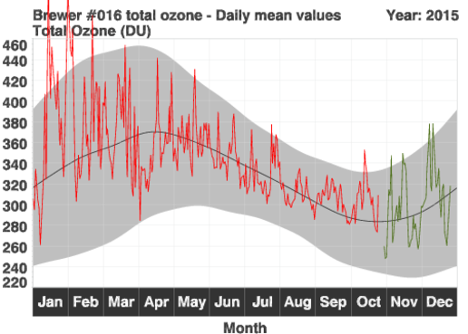
These are the measurements at meteoLCD for 2015, up to the 26th October: Look at what happened around the 10th April: in two days the thickness of the ozone column increased from 300 to 450 DU, and fell back to 363 DU the next day.

What all these measurements show is that our atmosphere is a very dynamic beast; change is the norm, and no change the exception! I remember that in the past when the TOC fell rapidly, the media were fast with alarmist articles about a vanishing ozone layer (evidently caused by human activity!) and our eradication by skin cancer. Had the authors waited a couple of days and had they not been ignorami of natural variations, these silly articles would not have been written.

There is no cause for alarm, as the total ozone layer has not been thinning since many years. The last figure shows the trend from our meteoLCD measurements (meteoLCD is still the only station measuring the TOC in Luxembourg).

total_ozone_column_trend_1998_2014

The general trend from 1998 to 2014 is positive, and that of the last 14 years practically flat. So no cause for alarm here!


4. Conclusion

The measurements of the ground ozone and the total ozone thickness document an extremely variable situation.  There is no even spread out of the ozone concentration, no well mixed situation, but a breathtaking variability. The atmosphere is a turbulent beast, not a smooth pudding!

PS: Do not forget to look form time to time at our ozone data by clicking on the “DOBSON (total O3)” link at http://meteo.lcd.lu

OECD climate report: a big swindle concerning Luxembourg ?

October 20, 2015

title_page

Many media write in ecstasy that this new report warns that the CO2 mitigation schemes of most countries do not allow to keep global warming below 2°C in 2100! Actually the main point of the report is that if all countries do not reduce their GHG emissions by 40-70% below their 2010 levels and by at least 100% by 2100, this 2°C target will be missed.  In this blog I will not muse on the absurdity of this 2°C level, which is a nearly complete guesswork derived from non-verified climate models. I just will take some items relating to Luxembourg, and will shows that this glossy report gives numbers concerning Luxembourg that are close to swindle.

1. Carbon intensity of electricity generation

Page 79 contains a graph showing the carbon intensity in g CO2 per kWh electricity produced for many countries: here Luxembourg’s CO2 intensity goes through the roof:

carbon_intensity_electricity_generation

The figure tells that Luxembourg produced its electricity in 1990 using 2552 g CO2 per kWh, which would have been a cosmic record! In 1990, Luxembourg consumed about 1250 GWh (here), about which 1000 GWh from coal. In 2013, the fraction between total thermal electricity consumption and in-country thermal production is 2.7.  This suggest an indigenous Luxembourg thermal production of 1000/2.7 = 360 GWh. There is absolutely no reason which would explain the abyssal low efficiency of Luxembourg’s own power plants to produce this tiny amount of electricity. This statistic is clearly nonsensical, and it is very telling about the care the authors took in checking their numbers.

The recent data are fully available at the web site of the ILR (Institut Luxembougeois de Régulation). I use the data for 2013 which can be summarized as follows:

Global electricity production = 1838 GWh

Production of thermal origin = 1575 GWh

Included in this category is the production of co-generation (“Blockheizkraftwerke”), of burning wood, bio-gas, landfill gas and the production of the TwinErg combined gas-turbine plant.
The balance of 263 GWh comes from wind, solar and hydro production.

Now let us assume that the thermal generation produces 500 g CO2 per GWh, which is about  the average for natural gas electricity power plants; notice that we include all bio-gas and wood burners here, where at least the last could be considered carbon neutral.

The 1575 GWh correspond to 7,88*10^11 g CO2 emitted in 2013 . Dividing this number by 1838*10^6 gives us a (maximum!) CO2 intensity of 429 g/KWh, well in line with the grey bar showing about 350 g/kWh.

The graph should have omitted the 1990 bar for Luxembourg; that it found its way into the figure shows that these graphs are milked from databases without any intelligent thinking.

2. Emissions per sector

At page 21 we find this figure:

emissionsbysector
Look at the distance between the two red lines: Luxembourg’s emissions from transport are close to 55% of the total! This is a world maximum! Do the Luxembourg people drive like crazy 24 hours a day on their 2967 total length of roads (including 147 km motorways)? Or do they drive gas guzzlers that use x*100 liter/100km ? Definitively no; the authors of the OECD report forgot to mention that close to 80% of all fuel sold at Luxembourg’s pump stations goes into foreign cars, and so does not stay in Luxembourg and can not be taken as an internal Luxembourg consumption. The real part of the transport sector emissions inside Luxembourg is closer to 55*0.2 =11%, similar to what can be found in Germany or Belgium. All statistics ignoring this basic fact are swindle, as are the monstrous 20.9 tons CO2 per capita emissions for Luxembourg computed by using wrong numbers and found in many databases (see here). A calculation method that is ok for large countries where fuel export is a tiny part of the total volume sold at the pumps can and must not be used for small countries where the major part of the pumped fuel goes into foreign car tanks.

3. CO2 efficiency

Now lets conclude with a more positive remark. The figure 1.2. shows the trend in GHG emissions versus GDP:

emissionchangeperGDPDuring the 23 years interval 1990 – 2012, Luxembourg’s efficiency increases dramatically. The GHG emissions per unit of GDP fall by close to 60%, bettering Germany and most other European countries. Alas, that the Russian Federation is the champion on this graph makes me think twice, damping the good patriotic vibrations.

4. Conclusion

This OECD report makes for a pleasant reading, but leaves with the impression of a quick copy/paste from various databases and a disturbing absence of critical thinking. The IPCC gospel is taken as a divine truth, and finally the laments reported in the media are not much more than the result of a primitive extrapolation of current CO2 emissions. One more of these sloppy reports that beat the drums waiting for COP21 !


_________________________________

03 Nov 2015:

just as another illustration how Luxembourg is seen on UNEP statistics (graph from UNEP): The red arrow point to Luxembourg, the size of the disk is proportional to the total CO2 emisions:

CO2perCapita_versus_GDP

Taking the plane? Say hello to radiation!

October 15, 2015

Radiation is one of the natural phenomena that many people are afraid of: we do not see this mysterious nuclear rays, and rarely do the media talk about radiation without pushing the scare level to the max.  But radiation is “natural”: the whole universe, and our planet, and our selves constantly bathe in a continuous flow of charged particles, energetic photons, fast neutrons and mysterious neutrinos which zip through us every second.

1. Cosmic and solar rays

Cosmic galactic rays originate from outside our solar system; they usually interact with nitrogen and oxygen in the atmosphere and produce a shower of different electrons, muons etc. Solar rays represent the “solar wind”, mainly formed from protons which are ejected by the huge solar fusion reactor. The solar wind is more intense when a “magnetic hole” = coronal hole opens at the sun’s surface. The charged protons are than free to be ejected into space; if the hole is directed to the earth, a more or less vigorous stream hits the atmosphere. Such a situation is happening now, as shown by this picture taken from the excellent web-site spaceweather.com (next figures all from this site).

coronal_hole

The turquoise circle shows a coronal hole; the white lines and arrows indicated the magnetic field lines which usually trap the protons. The number of these solar protons is continuously monitored by the geo-stationary GOES satellites or the ACE satellite positioned at the Lagrangian L1 point between Earth and Sun. Here the data for today, 15 October 2015:

current_conditions
As you can see, 2.4 protons per cm3 is not negligible: as your body volume is approx. 75 liter ( = 75000 cm3), this means that at this point of observation 180000 protons zip through you every second!

One understands that this type of radiation (and mostly rapid surges) can pose serious problems to astronauts on board of the ISS or future planetary travel.

2. Transatlantic travel by plane

It seems obvious, that cosmic radiation and solar protons are increasing with altitude, as the filtering air layer becomes thinner and thinner. Here is a graph showing the relative increase in radiation dose with altitude. Normal transatlantic flight is at about 40000 feet.

dose_rate_versus_altitudeThis plot made from real measurements shows that the dose rate is about 50 times higher than that at sea-level.  The next plot shows comparable data, this time in the usual unit for dose rate (nSv/h):

dose_rate_nSV_versus_altitudeHere in Diekirch we measure a background dose rate of about 80 to 84  nSv/h:

gamma_meteoLCD_15Oct2015

A transatlantic flight would correspond to a 26 times increase.

Now suppose you are a pilot or a steward(ess) and make 10 trips per month, which amounts to about 10*2*8 =160 hours (assuming 8 hours for one flight at high altitude). With a working year of 10 months this would amount to a supplementary radiation dose of 10*160*2200/1000000 = 3.52 mSv/year (the division by 1000000 transforms nSv to mSv). The Health Physics Society gives slightly lower exposures, as for instance 2.19 mSv/y.

3. Conclusion

Even if the dose rates at high altitudes seem impressive, the supplementary dose from one transatlantic travel is tiny. The usual background dose at many locations on Earth is about 3-4 mSv (with some outliers going  up to 260 mSv/y as in Ramsar, Iran), so even pilots and flight crew do not accumulate a dangerous radiation dose. The not so frequent flyer, be it for tourism or business, shouldn’t be scared. But if you intend to spend your next vacation on the Moon or on Mars, things will be different!