
An important addendum has been added the 5th October 2021.
Please read it at the end of the main text!
(missing fig. 19 added 05 Nov 2021)
———————————————-
It’s springtime in the Antarctica, and the well known ozone hole has again reached a spectacular dimension, extending well over the border of the continent; the picture shows the 23 million km2 hole at the 15th September 2021, covering more than the whole Antarctic continent (see https://ozonewatch.gsfc.nasa.gov/statistics/annual_data.html).
The Montreal Protocol signed in 1987 (and now counting 196 signature nations) was meant to avoid this anthropogenic thinning of the ozone layer by phasing out the CFC’s (chlorofluorocarbons) gases found to be the big ozone destroyers.
In this blog, I will see if this aim has been reached. I will start with some comments on ozone, its measurement and the scientists who received the Nobel price in 1995 for their research of atmospheric chemistry, and especially ozone creation and destruction.
1. Ozone, a delicate gas
Ozone (O3) is a very fragile gas, easily destroyed (it splits into O2 + O, where this single oxygen than reacts readily with other substances); for instance blowing a stream of ozone gas over a rough wall destroys a large percentage of the O3 molecules. This means that if ozone is sucked into a measuring instrument , the tubing must be very smooth, so that normally Teflon is used.
Ozone is created in nature essentially by two means: by lightning (electrical discharge) and by UV radiation. As it is very reactive, it is considered at ground level and higher concentrations a pollutant, harming biological tissues (like lungs and bronches) and also plants and crops. Its sterilizing properties are used in UV lamps installed for instance in the chirurgical environment and in water treatment plants. It has a very distinctive smell, and often can be smelled after a strong lightning storm.
2. Ozone in the atmosphere
Ozone is ubiquitous, found throughout the whole atmosphere, from ground level up to it’s top (TOA = Top Of the Atmosphere); the concentrations vary strongly with altitude. The ground level concentrations for instance are about 40 times lower than the peak concentration between 30-40 km:

The atmospheric O3 concentration at ground level is normally given in Dobson Unit (DU), named after Gordon Dobson (Uni Oxford), who in 1920 built the first instrument to measure ozone concentration. Imagine a cylinder with a base of 1m2 going from ground level to TOA. Now imagine that all gases except the O3 molecules are removed from this cylinder. Finally compress with a piston the O3 molecules to the bottom (kept at 0°C) until a pressure of 1013 hPa is reached. The height of the compressed gas would normally be about 3mm or 300 hundredth of a mm. One DU = 1/100 mm, so the concentration would be given as 300 DU and in fact corresponds to 300*2.687*10^20 = 8*10^22 ozone molecules. The DU number represents the Total Ozone Column (TOC), and all ground based measuring stations use this unit.
As UV radiation creates O3, it is also absorbed by ozone; the usual TOC instruments measure the absorption of several wavelengths in the UVB region (typical around 300 nm), and possibly some others to measure for instance the atmospheric water content. The Microtops II instruments that are in use at meteoLCD for measuring the TOC use the 305.5, 312.5 and 320 nm wavelengths [ref.1].
The very expensive Brewer Mark I and II instruments of the RMI (Royal Meteorological Institute of Uccle, Belgium) use optical gratings to have a much higher number of relevant wavelengths, and as such a better resolution.
The TOC varies enormously during very short periods, but over many years the daily averages follow a sine pattern, having in our region a maximum in spring and a minimum in autumn. The sinus-curve in the following figure represents the daily average at Uccle from 1971 to 2020 [ref. 3]

Read also this short paper on the cycle found at meteoLCD [ref.12]
Ozone soundings with balloons or lasers through the atmosphere are made from time to time; the following figure from RMI shows that the real distribution of ozone through the atmosphere is much more variable than suggested by the smooth curve in figure 1:

3. The ozone hole
Regular TOC measurements started with the International Geophysical Year in 1956. The next figure (which is a subset) shows the measurements over the minimum of Antarctic TOC from 1956 to 1979:

During the 80’s it was found that in autumn (September-October) the TOC reached very low values over the South Pole (which corresponds to the local spring time), extending even over much the Antarctic continent. The British scientists Farman, Gardiner and Shanklin reported in 1985 exceptionally low TOC values over the Halley and Faraday Antarctic research stations, a drop of about 40%. It was Farman who is credited introducing the name “ozone hole”, but it is possible that the Washington Post first used it in an article . A record minimum of 73 DU was measured in September 1994; for comparison the lowest value measured by meteoLCD in Diekirch since 1997 was 208.5 DU (18 November 2020). Fig. 5 shows the yearly minima of the Antarctic ozone hole and at Diekirch (Luxembourg):

Why should one worry about this ozone hole? The ozone layer in the stratosphere absorbs completely the shortest UV radiation wavelengths , as UVC (< 280nm), and a large part of the UVB spectrum (280-320 nm). UVB is important for some biological processes (like the production of vitamin D in humans), but a too large intensity creates havoc with cellular DNA and may lead to skin cancer, for instance. As the Antarctic is virtually population-free and vegetation free, this is not a problem on that continent; but if the CFC caused destruction works over the whole planet, there certainly will be an important health risk when the ozone protection screen becomes too thin.
Our measurements at meteoLCD show clearly that a lower TOC increases the biologically effective UVB radiation at ground-level, as documented in the following figure [ref. 11]:

4. The 1995 Nobel price in chemistry
The 1995 Nobel price in chemistry was given to 3 researchers in atmospheric chemistry: Paul Crutzen, Mario Molina and F. Sherwood Rowland. Crutzen’s work in the 1970’s was on the O3 destruction by naturally occurring nitrogen oxides, but Molina and Roland found in 1974 that the chlorofluorocarbon type chemical substances (CFC’s, with CFC-11 often called Freon by its tradename from Dupont de Nemour) release a very active chlorine ion in the cold upper atmosphere, which acts as a catalytic destroyer of ozone. One Cl- ion may destroy 100000 ozone molecules! The system of chemical reactions involved is rather complicated, and I suggest to read the lecture given by Molina in 1995 during the Nobel price ceremony [ref. 4].

This complex chemistry is not only fuelled by human emitted substances. One very often finds in the literature that CFC’s are a finger print of anthropogenic emissions, but it seems that the situation is more complicated. According to cfc-geologist [ref. 5] volcanoes also emit these compounds; a second important natural source of ozone depleting substances (ODS) is methyl bromide (CH3Br, also called bromomethane), emitted by algae (but also by humans for soil fumigation, for instance). A list of the many ODS can be found at the EPA website [ref.6]. This list also contains halons, like these used in fire protection systems.
For a very complete and more recent (2017) discussion of all the relevant equations and their kinetics see the paper by Wohltmann et al. [ref. 7].
5. The Montreal Protocol
This protocol, signed by 46 nations in September 1987, came in effect the 1st January 1989 and is ratified today by 197 nations. Its aim was to reduce the production of long-lived CFC’s by 50% by the year 2000, and finally phase it out completely. It is universally acclaimed as being the first protocol in global environmental protection. In 2016 an amendment was signed in Kigali to also phase out the HFC (hydrochlorofluorocarbons) which were the substances used to replace for instance Freon (CFC-11).
The production number of CFC’s indeed plunged to a very low level, at least according to the data submitted by the nations:

So considering this planned phase-out, the protocol seems to be a success.
6. Evolution of the Antarctic ozone hole
The next figure puts some cold water on the efficiency of the protocol. It shows the above graph with the yearly maximum ozone hole area superimposed:

Even if the CFC’s production becomes very low, the area of the ozone hole does not seem to change very much, except some wiggling around the 1994/96 levels. The next two figures show the maximum ozone hole area from 1990 to 2020 (data from NASA ozonewatch):

This plot shows that during the 31 years since 1990 the maximum ozone hole area shrinks by less than 10%. The linear regression suggests a shrinking by 0.7 millions km2 per decade. But note the two strange outlier years 2002 and 2019, which really seem suspect. If we omit these two outliers, we have the following picture:

Without these two outliers, the maximum ozone hole is shrinking in 31 years by a very meagre 0.73 million km2, i.e. by about 3.3%. The linear trend corresponds to an nearly insignificant -0.2 million km2 per decade. This very small number shows that the observational result of the Montreal Protocol is extremely limited until now.
7. Causes of the not shrinking hole
Let us first show the plot given in figure 4 in its entirety:

The figure shows that there is a distinctive ongoing thinning from the mid 1970’s on; but starting after 1992, the picture does not become clearer, neither after 2000: the measurement data show an important spread from year to year, and more intriguingly, from instrument to instrument.
There could be some very banal causes, which might be suggested by the stratospheric concentration data and by an increase of CFC-11 emissions after 2013 (possibly caused by illegal manufacture in China) [ref 8]:

Another or further reason might be that reversing the thinning takes many decades, possibly more than half a century, as predicted by some scientists [ref. 9] [ref.13]:

But there are also some reasons for hope. Direct measurements of reactive Cl- ions in the ozone hole (which were nearly impossible in the past) by a new satellite microwave sounder (MLS) has given examples that a yearly smaller DU loss correlates with a somewhat lower chlorine concentration [ref. 10]


8. Conclusion
So the least we can conclude, is that the picture remains muddled, and that reality is not what is found in the often glowing media reports, which present the Montreal Protocol as a definitive success story. The protocol is probably efficient in the very long run, but it certainly is not a quick acting fix. It is a very good example that tinkering with atmospheric gases is a complex matter, with the science far from settled, as shown for instance in the 2018 paper by Rolf Müller et al. [ref.14]. T
This lesson should also be heard by the CO2 alarmist who expect that rushing into a net-zero carbon policy would have immediate results.
ADDENDUM (05Oct2021):
There is very important chapter 2 by Douglass et al. published in the 2010 version of “The Scientific Assessment of Ozone Depletion” (link to all assessment reports); the title of this chapter 2 is “Stratospheric Ozone and Surface Ultraviolet Radiation” (link); here a link to a version with highlights added by me.
First let us start with fig.5 which shows the variations of TOC at two stations not too far away from Diekirch, Hohenpeissenberg and Haute Provence:

The measured TOC anomalies w.r. to the 1979-2010 mean (black curve) do not show any visible trend from about 1995 on. The next figure shows the erythemal UVB irradiances during the summer months May to August at Bilthoven (NL) and Uclle (BE): not surprisingly there is no trend in Bilthoven starting 1995, and a possible small positive trend in Uccle:

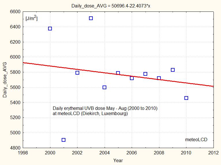
At meteoLCD the corresponding daily dose is decreasing from 2000 to 2010, as shown in figure 17:
Douglass also shows a figure with the minimum yearly TOC over the Antarctic core zone: look at the right part of the bottom graph which shows DU values that are practically constant.

The report many times writes that the ozone changes are not only caused by chemical destruction, but also for a large part by atmospheric dynamics, and that it is not easy to disentangle these to effects.
The last figure 19 on the chemical depletion also shows that from about 1992 to 2005 the few direct observations (black triangels) show a practically constant ozone depletion by chemical effects (and a huge variability of the many models).

References:
Ref 1:
https://meteo.lcd.lu/papers/Comparison_Microtops_Brewer16_2012.pdf
Ref 2:
https://ozone.meteo.be/research-themes/ozone/instrumental-research#graph-ozone-container
Ref 3:
https://meteo.lcd.lu/papers/annual_cycle.pdf
Ref 4:
nobelprize.org/uploads/2018/06/Molina-lecture.pdf
Ref 5:
cfc.geologist-1011.net
Ref 6:
https://www.epa.gov/ozone-layer-protection/ozone-depleting-substances
Ref 7:
https://acp.copernicus.org/articles/17/1/10535/2017/acp-17-10535-2017.pdf
Ref 8:
https://www.pnas.org/content/118/12/e2021528118
Ref 9:
https://www.nature.com/articles/s41467-019-13717-x
Ref 10:
https://earthobservatory.nasa.gov/images/91694/measurements-show-reduction-in-ozone-eating-chemical
Ref 11:
https://meteo.lcd.lu/papers/MASSEN/RAF_from_sudden_TOC_dip.pdf
Ref 12:
https://meteo.lcd.lu/papers/annual_cycle.pdf
Ref 13:
https://www.nature.com/articles/s41467-019-13717-x.pdf
Ref 14:
https://acp.copernicus.org/articles/18/2985/2018/
Ref 15:


