 This is part 1.
Click on the links below for the other parts.
Part 2, 3, 4, 5.
Luxembourg’s Environmental Agency has joined the AQI-train and published a smartphone app called “Meng Loft” (= my Air) which gives an air quality index (AQI) for Luxembourg and/or sub-regions of the country. There are many different AQI’s around the world, and in this multi-part comment I try to clarify a bit the overwhelming number of country/administration specific definitions.
1. What’s an index?
An index is a single number which should simplify a more complex situation. A good example is the UV-Index (UVI) which represents by a single number (in practice between 0 and about 12) the “dangerosity” of solar UVB irradiance. The biological effect of UVB is expressed as a dose intensity in the biological effective unit MED/h (minimum erythemal dose per hour). A person of a certain skin complexion (phototype II) is assumed to have a reddening of the skin (an erythema) after having received this dose. Physically speaking the dose represents an energy (a number of Joule per m2), and the instruments measuring UVB measure a dose per time unit: our UVB Solarlight biometer at meteoLCD measures MED/h per m2. The UVI is defined as a biologically effective UVB irradiance of 25mW/m2 where UVB extents to wavelengths between 298 and 320 nm. So here we have an index that represents simply a scale-factor for the physical unit: the UVI is strictly proportional to the physical unit of the relevant phenomenon.
2. What’s air quality?
The air we inhale is a mixture of many components, where some are considered as potentially harmful above a certain level (or concentration). The three core “pollutants” are ground ozone (O3), nitrogen dioxide (NO2) and fine particles (PM10, PM2.5). Please note that all theses substances exist in every type of air and have both natural and anthropogenic origins. So the qualifier “pollutant” is slightly misleading: theses substances should be seen as “pollutants” if their concentration exceeds certain levels. Besides these 3 core substances many others are often considered, mainly CO, SO2 and NO etc…
One real problem is the measurement of theses substances and the units used. O3 for instance is measured by the big expensive sensors by its absorption of certain UVB wavelengths (e.g. our previous O341M sensor by Environnement SA); other sensors use chemical reactions that change an electrical current (amperometric sensors as our CAIRSENS) and so on. The concentration of O3 and NO2 can be expressed as a sub-volume in a reference volume (usually in ppb =parts per volume) or as a mass in a reference volume (microgram per m3 = ug/m3). The big advantage of the ppb unit is that it is independent of ambient pressure and temperature; the big disadvantage of the ug/m3 unit is that it depends on a standard pressure (1013.25 hPa) and a standard temperature (usually 25°C, but also 20°C). Many countries like the USA use the ppb (or ppm), but the EU has decided to use the ug/m3 unit. As the standard temperature for gases in the EU is often taken as 20°C (but frquently also as 25°C) there is much room for confusion. The conversion factors from ppb to ug/m3 are the following (see here):
O3: to change ppb to ug/m3 multiply by 1.996 if standard temp. is 20°C and by 1.962 if standard temp. is 25°C
NO2: to change ppb to ug/m3 multiply by 1.913 if standard temp. is 20°C and by 1.880 if standard temp. is 25°C
The concentration of fine particles (PM10, PM2.5) is universally given as mass per volume (ug/m3). PM10 are particles up to a size of 10 micrometers, PM2.5 up to 2.5 um. On-line measurement principles are either the attenuation of beta radiation or the scattering of light (laser light); these techniques all must be done in known gas conditions and dry air (measurement with new low-cost sensors as the Nova SDS011 give absolutely wrong results outside a very narrow humidity range). PM2.5 are much more difficult to measure so that many stations keep to PM10’s.
3. Not one but many AQI’s
Every pollutant has its own AQI, and usually it is defined by a “break-point” table relating concentration to this AQI. The resulting graph is a polygone, so that over its full range there is no proportionality between concentration and AQI. The numerical range of the AQI varies enormously from country to country: for instance 0-500 in the US and 0-100 in many EU countries. This numerical range is divided into quality levels (e.g. Excellent to Hazardous) and the number of these levels and the precise wording also is not standardized.
But how to you define a single AQI out of an ensemble of for instance 3 core pollutants? Here the methodology is the same everywhere on the world: the defining AQI is the highest sub-AQI. An example: if O3-AQI = 80, NO2-AQI = 60 and PM10-AQI =50 then the published AQI is 80. This definition often leads to difficult to understand results. If O3 levels are normally high at a pure air mountainous station, but NO2 and PM levels low, that station may be qualified as poorer than a city with slightly lower O3 but much higher NO2 and PM concentrations.
4. The EPA AQI
Let us start with the US EPA (Environmental Protection Agency) AQI, as defined in the last revision. Here is the “break-point” table which defines the specific “sub-AQI’s” for the different pollutants considered by the EPA ( in yellow the 3 core pollutants):
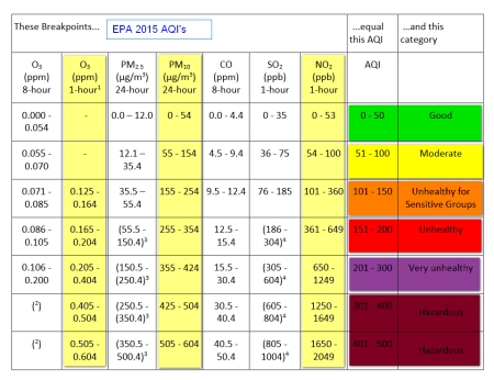
To approximately convert either O3 or NO2 to ug/m3, use a multiplier of 2.
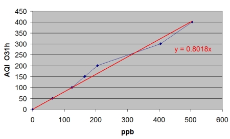
A first problem is that lower 1 hour O3 levels do not have an EPA AQI, what is unfortunate because usually all measurement stations give at least one measurement per hour. To simplify let us take break-points 0…62 and 63…124 for the O3 1h series. Clearly the steps corresponding to the concentration are not of the same magnitude: an AQI [0…50] corresponds to concentrations [0…54 ppb] whereas the same AQI step of 50 [1001…150] corresponds to [125…164 ppb], a much lower concentration increase . The graphical representation is a polygon: there is a proportionality between concentration and AQI from one break-point to the next, but no proportionality from 0 to maximum concentration as shown in the next graph (the red line is a calculated trend-line with its equation to show the deviation with the polygon):
The EPA AQI has 6 quality levels, from GOOD to HAZARDOUS, and runs from 0 to 500. Many on-line sites give a real-time view of the EPA AQI for the entire world, the local measurements being converted according to the EPA standard:
The following figure shows the situation given by http://waqi.info today:
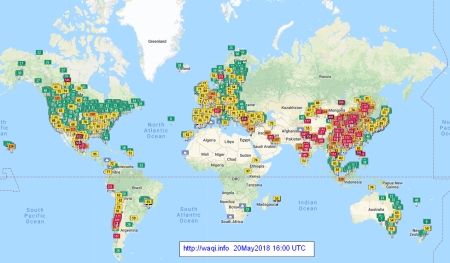
Zooming into the figure allows to inspect individual stations and the time series of the last two days.
The quality levels of EPA are relatively “generous”: an 8h O3 concentration of 100 ug/m3 still qualifies as GOOD, whereas in Luxembourg is runs under “MEDIUM”.
(to be continued)

May 21, 2018 at 15:19 |
[…] A weblog on climate, global change and climate measurements « AQI: air quality confusion (1) […]
May 29, 2018 at 10:17 |
one more may be important detail is the ultrafine dust contamination, which is hidden in the PM10 and PM2.5 measurements, since expressed in mug/cm3 the impact is neglectable. As an example the particle count (6-40nm) of a measurement on the Copenhagen airport is close to 36000 particles/cm3 whereas the one of a busy traffic street nearby is about 1000. Obviously the high ultrafine particle concentration is not visible on PM 10000 nm or PM 2500 nm expressed in mug/cm3. Researchers state however that especially those particles penetrate deep into the lungs, get into the bloodstream and trigger e.g. cardiovascular diseases. I estimated that the Luxembourg airport situated in the highest population density area “burns” daily more than 50 tons of kerosene considering LTO (landing and take off) cycles. The environmental authorities do not yet monitor ultrafine particles sine the combustion of kerosene in aircrafts is thought to be perfect (without exhaust). Measurements performed on airports around the globe with special nanoparticle devices show that is far from being the case. Parallelly studies around the recent Diesel story tend to show: The cleaner the combustion the finer the exhaust particles. To prioritize environmental impact efforts it would be indicated to perform similar measurements in the vicinity of the Lux airport. However I haven’t found any clinical study on mortality and morbidity rate in the vicinity of airports. All the studies I find relate to the increased noise. I would highly appreciate if anybody could give me a hint in that respect. Thank you in advance!
May 23, 2018 at 16:14 |
[…] 1, […]
May 27, 2018 at 16:59 |
[…] 1, 2, […]
May 29, 2018 at 13:20 |
[…] 1, 2, 3, […]
October 13, 2018 at 17:03 |
[…] to define the different ranges (you might read my blog about “AQI air quality confusion: https://meteolcd.wordpress.com/2018/05/20/aqi-air-quality-confusion-1/). So it would be nice to get the concentrations of the different pollutants (e.g. [NO2] in ug/m3) […]